 Free Fonts Family
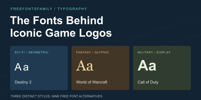
Few game logos are as familiar as these 3. The Call of Duty series started in 2003, World of Warcraft launched in North America on November 23, 2004, and Destiny 2 arrived in 2017. Players stay with these games for years, and their lettering turns up on clan crests, guild recruitment posts, stream overlays and fan posters.
Each game also has a busy world around it: wikis, esports leagues, content creators and services such as LFCarry, an AI gaming companion and a marketplace for optional services from professional players (coaching, carries, leveling, in-game gold), running since 2016. Anyone who designs for these players soon hears the same request: make it look like the game.
Each logo is lettering shaped for its game, sometimes on top of a well-known typeface. Here is what sits behind them, with free fonts that capture the same look.
Destiny 2: thin geometric capitals
The Destiny 2 logo places the word DESTINY above the number 2 in thin capital letters. Its strict geometry uses thin, evenly weighted strokes with clean-cut ends and subtle points, which give the name a technological, futuristic feel. The colors stay just as restrained: black and white.
The wordmark keeps a distinctive character of its own, and among retail typefaces Futura Regular comes close to it. Paul Renner released Futura in 1927 as a geometric sans-serif based on simple shapes, especially the circle.
Among free fonts, 3 get close to the same look. Josefin Sans by Santiago Orozco is geometric and elegant, with a vintage feeling inspired by the geometric sans-serifs of the 1920s. Its x-height sits halfway up to the cap height, an unusual proportion that stops mattering in all capitals.
Exo 2 by Natanael Gama is a contemporary geometric sans with a technological, futuristic feeling that suits the sci-fi side of the logo.
Jost by Owen Earl of the indestructible type foundry draws on 1920s German sans-serifs, which makes it the closest free relative of Futura here.
All 3 go as thin as weight 100. For the Destiny look, set the name light with generous letter spacing, white on black.
World of Warcraft: a serif title and Friz Quadrata
The World of Warcraft logo works on 2 levels, each with its own typeface. “World” is set in an elegant, thin serif with shadows, and the word “of” sits inside its letter “o”. “Warcraft” below it uses wide, curly characters with a Gothic flavor. A golden frame with small spikes surrounds the name, and each expansion brings its own color scheme, most often gold, silver and copper, with a patinated metal texture that adds a heraldic touch.
Inside the game, character names and item information appear in Friz Quadrata, as they did in Warcraft III in 2002. Ernst Friz and Victor Caruso designed this glyphic serif for Visual Graphics Corporation in 1966, and a bold weight followed with the International Typeface Corporation. It also appeared in the League of Legends logo until 2019. Players who swap the interface font drop a replacement named FRIZQT__.ttf into a Fonts folder in the game directory.
Among free fonts, 2 carry the same spirit. Marcellus by Astigmatic is a flared serif inspired by classic Roman inscription letterforms. It shares the chiseled, glyphic character of Friz Quadrata and works well for quest-style headings and item cards.
Cinzel by Natanael Gama follows 1st century Roman inscriptions and classical proportions, with a contemporary feel added. Set in capitals, it makes a convincing stand-in for the “World” line of the logo.
For the “Warcraft” line, effects do most of the work: a bevel, a gold or silver gradient, a dark outline and an ornamental frame.
Call of Duty: from Impact to Hitmarker
From 2003 until Modern Warfare 3 in 2023, the series logo was set in Impact with minor alterations, a run of 20 years. Geoffrey Lee designed Impact in 1965, and the Stephenson Blake foundry of Sheffield released it in a decade that favored condensed, bold, industrial sans-serifs. It has shipped with Microsoft Windows since Windows 98.
Call of Duty 4: Modern Warfare shows the full type system of that era. The Impact logo carried a bevel and a chrome effect, and “Modern Warfare” was set in Bank Gothic with a green glow that recalls night vision goggles. Briefing cut-scenes used Eurostile in normal and extended widths, Carbon handled mission objectives and the multiplayer HUD, and ITC Conduit covered most of the interface.
In 2023 the franchise, by then 23 titles over 20 years, was rebranded with the design studio Koto. The new wordmark keeps the familiar structure, with CALL and DUTY large and a small OF between them, while the rounded shapes give way to sharp, angular letters built on 90-degree corners.
The typeface behind it is Hitmarker, a family designed solely for Call of Duty, which Koto developed with the type foundry NaN. It is rooted in classic military vernacular, big, bold and blocky, and built on contemporary typographic principles. The headline version comes in 15 fixed fonts (3 widths, each in 5 weights), a variable version handles title art, and a text version is designed for small interface type and long copy. The family supports 317 languages.
Among free fonts, 4 cover the different eras. Anton by Vernon Adams reworks a traditional advertising sans serif as a bold display face, and its tall, heavy letters suit the Impact years.
Black Ops One by James Grieshaber and Eben Sorkin is a low contrast, semi geometric typeface inspired by military stencil lettering. It is heavy and punchy, and its small stencil cuts read best at medium and large sizes.
Michroma by Vernon Adams belongs to the rounded-square genre that Microgramma pioneered in 1952. Eurostile, the most famous family of that genre, followed 10 years later, so Michroma fits briefing screens in the Modern Warfare style.
Chakra Petch by Cadson Demak is a square sans serif with tapered corners, a good free match for the angular Hitmarker era.
Getting the game look in your own designs
A free font gets a design most of the way, and spacing, weight and effects finish the job. Start with the era you want to echo, since Call of Duty alone has 2 distinct looks.
Keep display faces for short text such as a title, a clan name or a stream status, and pair them with a plain sans-serif for schedules and descriptions.
Then test the design at the size people will see it. Thumbnails and stream overlays are often viewed small, where thin strokes and stencil cuts fade fast, so go bigger or heavier when they disappear. All 9 free fonts here are open source, which makes side-by-side tests easy.
Quick reference
|
Game |
Logo and in-game type |
Free alternatives |
|---|---|---|
|
Destiny 2 |
Thin geometric capitals close to Futura Regular |
Josefin Sans, Exo 2, Jost |
|
World of Warcraft |
Thin serif “World”, Gothic-style “Warcraft”, Friz Quadrata in the interface |
Marcellus, Cinzel |
|
Call of Duty |
Impact until 2023, then Hitmarker; Bank Gothic, Eurostile, Carbon and ITC Conduit in Call of Duty 4 |
Anton, Black Ops One, Michroma, Chakra Petch |
Pick the free font that matches the era, then spend the rest of the time on spacing and effects, where game lettering gets its character.