 Free Fonts Family
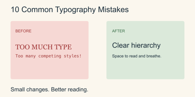
Typography problems often come from many small decisions rather than one unsuitable font. A page may feel crowded because its lines are too close together, or confusing because every heading competes for attention. Fixing those details can improve the design without replacing its entire visual identity.
Use these ten checks on a real page from your project. Make one change at a time so you can see which adjustment helps.
1. Using too many font families
Multiple families can make a small layout feel fragmented. Start with one or two and assign a clear job to each. Use weight and size to create variety before adding another family.
2. Making every element equally prominent
If the title, subtitle, paragraph, and button all look equally loud, readers struggle to find a starting point. Give the main heading the strongest emphasis and reduce the weight or size of supporting text.
3. Setting paragraphs too small
A paragraph that looks tidy on a large monitor may be uncomfortable on a phone. Check the layout at the intended size and zoom. Increase text size when needed, then adjust the surrounding spacing so the page can accommodate it.
4. Letting lines become too long
Wide paragraphs can make it difficult to find the next line. Try a narrower text column and read several lines aloud. Compare the result with your original layout rather than relying on a fixed width for every font.
5. Squeezing line spacing
Tight lines can make a paragraph look darker and harder to follow. Increase line spacing gradually until each line feels distinct. Headings and body paragraphs usually need different spacing decisions.
6. Stretching letters to fit
Pulling text wider or taller changes the intended letterforms. Try a different size, a genuine condensed style, or a revised line break instead. Preserve the font’s proportions when resizing it.
7. Using decorative fonts for everything
An expressive face may work beautifully for a short phrase but become tiring in instructions or product details. Keep its role limited and choose a clearer companion for text that people must read quickly.
8. Ignoring contrast against the background
Text can disappear over a busy photograph or a similar color. Move it to a quieter area, add a consistent background panel, or change the foreground and background colors. Check the actual combination with an accessibility contrast tool, including smaller labels and links.
9. Changing styles without a system
Small inconsistencies accumulate across a website or presentation. Record a short set of heading, paragraph, caption, and link styles. Reuse them instead of adjusting each block independently.
10. Skipping the final reading check
Placeholder text hides problems with real names, long headings, punctuation, and numbers. Review the finished words in the final layout. Check mobile wrapping, missing characters, and unexpected fallback fonts before publishing.
A simple improvement routine
Begin with a representative page. Check hierarchy first, then paragraph size, line length, spacing, and contrast. Finally, inspect the small details such as captions and buttons. Save a before-and-after view so you can judge whether the changes actually make reading easier.
If the font itself still feels unsuitable, read How to Find the Best Fonts?. If the families compete with one another, try the examples in How to Pair Fonts?.