 Free Fonts Family
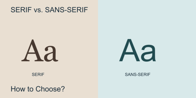
Serif and sans-serif fonts offer two broad starting points for a design. Serif letters include finishing strokes at the ends of their main strokes; sans-serif letters generally leave those details out. That visible difference can influence a page’s character, but it does not decide whether a font is right for your project.
To choose well, compare actual text in context. Your audience, reading size, layout, and message matter more than a category label.
What does a serif font bring to a design?
A serif can suggest a literary, editorial, or traditional tone. It is a useful direction to explore for a magazine, book-inspired website, or established brand. However, a high-contrast fashion headline and a sturdy reading face are both serifs, despite serving very different purposes.
Look closely at the details. Thin strokes may need a larger size, while more robust shapes can hold up better when the design becomes small. Test the font rather than assuming every serif works the same way.
When should you try a sans-serif?
Sans-serif fonts are a useful starting point for interfaces, wayfinding, and straightforward branding. Some feel geometric and precise; others feel open and informal. That variety gives you room to choose a voice without introducing ornamental detail.
A sans-serif can also work for long text. Comfortable spacing and a suitable size are essential. The absence of serifs does not automatically make a typeface easier to read.
Compare readability at the final size
Place a paragraph in each candidate and use the same column width. Adjust sizes until the letters appear comparable, then inspect the line spacing. Read an entire paragraph instead of judging a single large word.
For a website, test a phone-sized layout. For print, make a sample at the intended dimensions. Check punctuation, numerals, and easily confused characters. A font that feels attractive in a specimen may lose clarity in a compact label.
Match the tone to the message
Imagine a museum exhibition, a children’s workshop, and a financial report. Each might use either category, but the selected family should support the intended tone. Ask whether the text feels serious, warm, energetic, or restrained, and whether that feeling belongs in the project.
Use both when they have clear roles
You can pair a serif heading with sans-serif body text, or reverse the arrangement. Give each family a consistent role and avoid switching roles from page to page. Start with a restrained body font and choose a heading face that adds enough contrast.
Read How to Pair Fonts? for a step-by-step approach. If one family already provides enough contrast through weight and size, a second is optional.
A quick decision checklist
- Does the font stay readable at the actual viewing size?
- Does its tone fit the message and audience?
- Does it contain the characters and styles the project needs?
- Does the license cover your intended use?
- Does it work in a complete layout, including headings and labels?
Choose the candidate that performs best across those questions. For sans-serif options to compare, explore our Top 10 Best Sans-Serif Fonts shortlist.