 Free Fonts Family
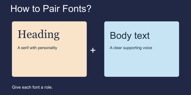
Pairing fonts starts with deciding what each typeface needs to do. Give one font the job of attracting attention in headings and another the job of making paragraphs easy to read. A successful combination helps readers understand the page before they notice the fonts themselves.
You do not need a large collection to begin. Two families are usually enough for a small website, invitation, or brand presentation. You can also build an entire design with one family by varying its size and weight.
Choose the body font first
For text-heavy projects, start with the font people will spend the most time reading. Test it with a real paragraph at the intended size. Check punctuation, numbers, and the characters your audience needs. Once that foundation is comfortable, try heading fonts beside it.
Create contrast with a purpose
A serif heading with sans-serif body text is a useful starting point, but category labels alone do not guarantee a good match. Compare the proportions, stroke weight, and overall mood of the actual letters. Two very similar families can look accidentally inconsistent; two highly expressive families can compete for attention.
Use one distinctive voice and give it a quieter companion. If the heading has elaborate shapes, keep labels and paragraphs restrained.
Try these three starting combinations
- Playfair Display with Source Sans 3: Try Playfair Display for large editorial headings and Source Sans 3 for readable supporting text.
- Montserrat with Lora: Try Montserrat for short headings and Lora for paragraphs in a magazine or portfolio layout.
- One family, different weights: Try Inter regular for body text and a heavier Inter weight for headings when you want a consistent interface.
These are suggestions to test, not universal rules. Compare the combinations using your own words, available space, and audience.
Balance apparent size and weight
Two fonts set at the same numeric size may look different in size. Adjust them by eye so headings, labels, and body text form a clear hierarchy. Set line spacing independently for each role. Avoid tight body text simply because compact headings look attractive.
Keep decorative fonts in small doses
A script or unusual display face can work well for a short accent. Use it where readers have time to recognize the letters. Essential details such as navigation, prices, and contact information usually benefit from a more straightforward treatment.
Compare the pair in a complete layout
Build one sample containing a heading, paragraph, link, button, and number. Check it on a small screen or print it at the intended size. If every element attracts equal attention, simplify the weights or remove one family.
Finally, confirm the licenses for both fonts and write down the styles you selected. A small, repeatable set of choices is easier to maintain than a different pairing on every page.
For a deeper look at letterform construction, see Google Fonts’ guide to pairing typefaces. You can also read How to Find the Best Fonts? before building your shortlist.